In 2017, mobile-driven web traffic beat desktop for the first time, and since then it has only grown stronger. Mobile devices now direct the majority of web traffic, and even Google ranks mobile-friendly sites higher. So if your website is not optimized for mobile phones and tablets, you are losing out in more ways than one.
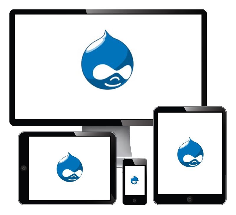
Fortunately, most modern content management systems come prepared with an arsenal of tools that facilitate the creation of mobile websites and optimize responsiveness. However, Drupal 8 stands out with its out-of-the-box features for responsive web design.
Fortunately, most modern content management systems come prepared with an arsenal of tools that facilitate the creation of mobile websites and optimize responsiveness. However, Drupal 8 stands out with its out-of-the-box features for responsive web design.
Choose Drupal 8 for Mobile-Friendly Website
Why Drupal 8?
Since the announcement of Drupal 8’s launch during the early days, one of the overarching goals of the platform was to make it a mobile-first framework. Owing to the efforts of Drupal 8 mobile initiative, it is an ideal choice to build websites for mobile devices, but also for developing mobile apps and responsive websites. All aspects of Drupal 8 support responsive design, so your site works for all types of device owners and content editors no matter what device they use.
Intuitive & mobile friendly interface
All the content authoring features in Drupal 8 are built with the mobile-first approach. Hence the new admin toolbar is responsive, expanding and orienting itself on different screen sizes and collapsing vertically on smaller sizes, automatically. This improved admin interface means that you can make changes on-the-go from any device.
Mobile content optimization
Drupal 8 provides a host of responsive components and modules to help your website work on any device. These include theme flexibility, responsive image sizes, and rapid loading of content. The mobile-friendly platform handles your website effortlessly. Mobile optimized content means your users won’t have to wait for content to load or scroll endlessly to find the next bit of information.
Responsiveness is at the heart of building mobile-friendly experiences. Drupal 8’s website theme is pre-built with all the responsive elements that scale sections of the pages and toolbars, for compatibility with all device screen sizes. As far as images are concerned, the website admin only needs to provide one high resolution image and Drupal 8 automatically scales it according to the target screen.
Improved performance
The overall performance of your website bears an impact on your audience’s experience. Drupal 8 is designed to reduce the front-end footprint of your mobile site to boost its performance. Drupal 8 achieves this by replacing jQuery with native JavaScript where it is possible and doesn’t load jQuery by default for anonymous visitors. Moreover, Drupal 8 users lighter alternatives to the JavaScript intensive features that are mobile friendly.
Responsive tables
Mobile websites need to display tables correctly so that the meaning and information is not misrepresented. Drupal 8 enables developers to build responsive tables so that while building, they can declare each column’s importance ranging from high, medium to low importance. The wider screens display all columns as they are, but with shrinking screen size, the least important ones will begin to drop off so that the table displays well without loss of critical data.
Lightning for Drupal 8
Last year, Acquia announced the launch of Acquia Lightning, which is an open source distribution of Drupal, available freely that accelerates Drupal 8 development, streamlines content authoring for business users on the go and also makes it super easy to manage content and experiences. It offers drag and drop tools for developers to build flexible, responsive layouts and experiences. These simplified user experience and authoring enable a Drupal web development company India to build highly personalized and responsive mobile journeys.
Finally
The increase in new devices and channels coupled with the high expectations for mobile experiences have increased the stakes for developers and builders of digital skills. Drupal 8’s advanced mobile capabilities empower builders to go mobile-first and provide a sophisticated omnichannel journey to its users.
Do you agree? Let us know your views in the section below.
 RSS Feed
